Google refreshes iconic 'G' logo with subtle design update
The updated design stays true to the company’s familiar four-colour palette, yet introduces softer transitions.
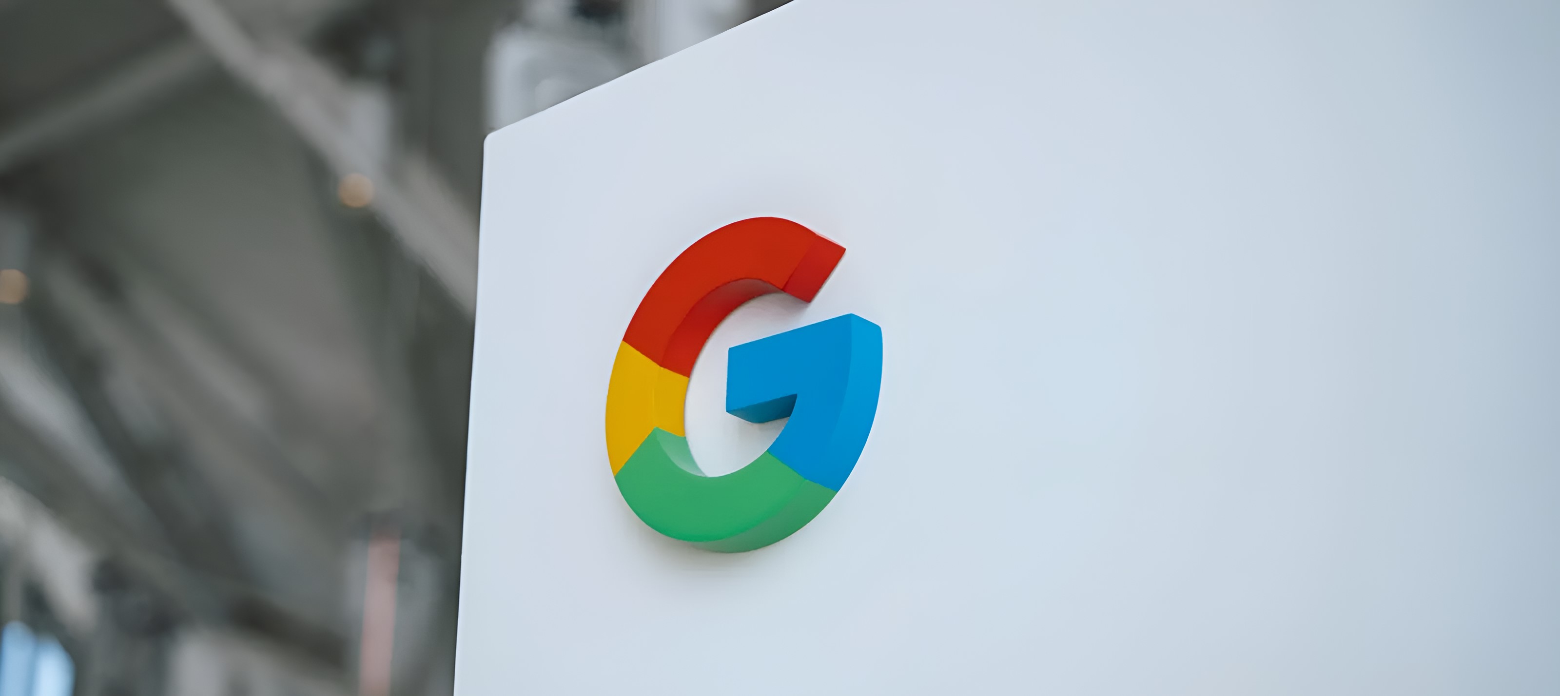
Google has quietly rolled out a refreshed version of its iconic ‘G’ logo, making subtle but noticeable changes to its shape and colour flow.
The updated design stays true to the company’s familiar four-colour palette, yet introduces softer transitions and more balanced proportions, creating a cleaner and more polished look.
Though the shift may seem minor at first glance, the refined logo now blends its colours more smoothly, enhancing the harmony between the blue, red, yellow, and green sections.
This results in a more cohesive appearance that still retains the recognisable essence of Google’s brand identity.
The adjustment fits into a broader strategy by the company to make thoughtful, gradual design updates without disrupting the familiarity users have come to expect.
The ‘G’ may look almost the same, but the slight tweaks make it feel more modern and visually accessible.
"Design is always evolving, and we regularly make small adjustments to ensure our brand remains accessible, approachable, and relevant," a Google representative stated.
The updated logo has already begun appearing across various Google apps and services, with a full rollout expected in the coming days.